ShopDreamUp AI ArtDreamUp

Deviation Actions


Suggested Deviants


Suggested Collections


You Might Like…


Featured in Groups

Comments7
Join the community to add your comment. Already a deviant? Log In
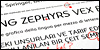
There are some inspiring shapes in here though the font still requires a lot of streamlining. The 's' for example is quite unusual but I like it a lot, but there's a dent in the bottom loop. You have more of these dents in other letters as well. Letters like 'r' and 'u' look too short and I'm pretty convinced the 'a' is too big, Why are the 'f' and 'g' so extravagant while the 't' is so orthodox and subtle?